


We dove into our study of nonfiction text features over the last two weeks. We started with a sorting activity for fiction and nonfiction text features. The students had a few misconceptions, but we were able to clear those up.


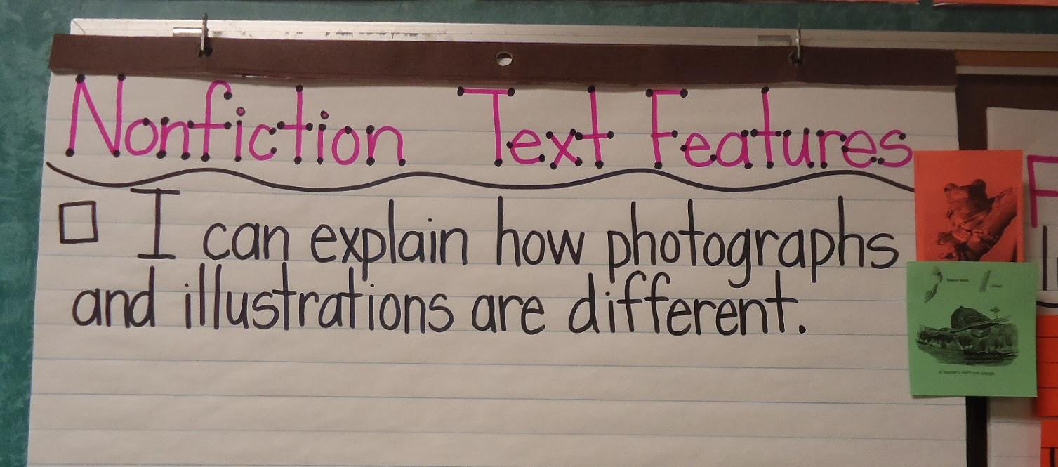
Next up was our first target: explaining the differences between photographs and illustrations. After showing various pictures from text, students were able to narrow down the difference. On the chart below you can see two pictures off to the side: orange – a photograph of a frog, green – illustration of a beaver. We also had an amazing discussion about why an author may choose to use illustrations over photographs in nonfiction text.
While teaching students about the important work of Dr. Martin Luther King, Jr., we also had an opportunity to put our knowledge of photographs and illustrations to work. We used the two books you see below. In fact, the cover of the book on the left has a matching illustration in the book on the right. The kids loved looking at the same picture in two different ways.


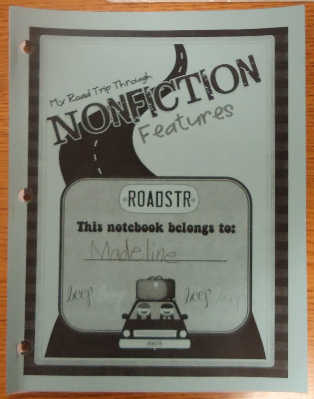
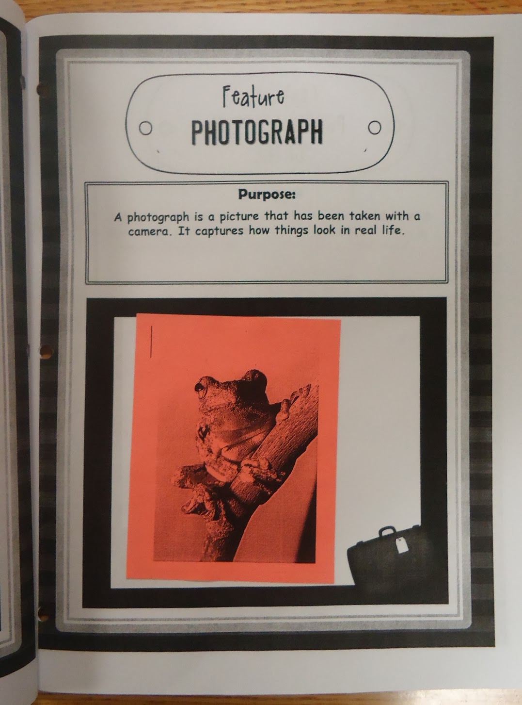
Once students were able to explain the differences, it was time to put the examples into their Nonfiction scrapbooks. This is from Hope Kings’s product, My Road Trip Through Nonfiction Text Features.
As we visit and study various text features, we attach the same pictures from the anchor charts into our scrapbooks for cohesive learning. The pictures below show the pages students see inside of their scrapbooks.

Next up is learning to identify bold and italic text in our reading and explain why an author uses those text features.
3 Responses
LOVE the new look girl! Super cute design.
Tania
My Second Sense
This is a brilliant lesson! So excited to do the fiction/non-fiction sort in class tomorrow!
This is wonderful. Thanks for sharing.